Difference between revisions of "Presenting Results"
| Line 1: | Line 1: | ||
== Displaying Numerical Summary of Results == | == Displaying Numerical Summary of Results == | ||
After running a job, the results are displayed in the lower half of the Job View Window. | |||
The user then can see the results of all jobs displayed in the upper half of the job View Window by selecting individual jobs one at the time. | |||
The user can also compare multiple job results by selecting multiple jobs at one time. This can be done by holding down the ctrl key while clicking on each job. | |||
<gallery> | |||
Image:20090406 Job View Compairing Results.gif|Fig. A - Compairing multiple results in Job View Window | |||
</gallery> | |||
== Displaying Results in Geographic View == | == Displaying Results in Geographic View == | ||
| Line 12: | Line 20: | ||
<gallery> | <gallery> | ||
Image:20090406 Results in GeoView.gif|Fig. | Image:20090406 Results in GeoView.gif|Fig. B - Colour Coded Geographic view of results. | ||
</gallery> | </gallery> | ||
== Displaying Results on Tabular Form == | == Displaying Results on Tabular Form == | ||
The results can be presented as ship-ship collisions. Click on the icon [[Image:20090406 Tabular Result Button.gif]] in the Job View Window and a window similar to fig. | The results can be presented as ship-ship collisions. Click on the icon [[Image:20090406 Tabular Result Button.gif]] in the Job View Window and a window similar to fig. C below will appear. | ||
Here the striking ships are shown horizontally and the struck ships are shown vertically. | Here the striking ships are shown horizontally and the struck ships are shown vertically. | ||
| Line 28: | Line 36: | ||
<gallery> | <gallery> | ||
Image:20090406 Tabular Ship-Ship Collision Results.gif|Fig. | Image:20090406 Tabular Ship-Ship Collision Results.gif|Fig. C - Tabular view of Ship-Ship Collisions | ||
</gallery> | |||
== User defined Result Diagrams == | |||
The results may also be shown using the Diagram Button [[Image:20090406 Diagram Button.gif]] in the Job View window. | |||
Here the user can specify the diagrams or chose a default diagram. | |||
The user can choose to have the results shown according to legs or ship type. | |||
In Fig. D, the results are shown per leg. It is seen which legs contribute most to the collision probability of the area. In Fig. E, the results are shown per ship type. Here one can see which ship types contribute the most to the calculated incident frequencies. | |||
<gallery> | |||
Image:20090406 Results Diagram format1.gif|Fig. D - Diagram View, Results displayed for each Leg | |||
Image:20090406 Results Diagram format2.gif|Fig. E - Diagram View, Results per Ship Type | |||
</gallery> | </gallery> | ||
== Customised presentation of results == | |||
Should the user need to furter customise the presentation of the results of an analysis, the resykts are available on Comma Separated Value (CSV) format. | |||
The results are stored as csv-files in the folder grisk_jobs->{unique string}->results | |||
[[Image:20090406 Results as CSV.gif]] | |||
[[Category:User Manual]] | |||
Latest revision as of 23:22, 6 April 2009
Displaying Numerical Summary of Results
After running a job, the results are displayed in the lower half of the Job View Window.
The user then can see the results of all jobs displayed in the upper half of the job View Window by selecting individual jobs one at the time.
The user can also compare multiple job results by selecting multiple jobs at one time. This can be done by holding down the ctrl key while clicking on each job.
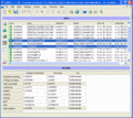
Fig. A - Compairing multiple results in Job View Window

Displaying Results in Geographic View
To display the results geographically select the Geographic Result Icon ![]() to left.
to left.
The results are presented by colouring the legs and ground segments. The colour scale is relative, meaning that the highest probability is given the colour red and the lowest is given the colour yellow. So the red colour does not necessarily imply the leg or ground segment is a high risk area.
Collisions are displayed as colours on the legs while Groundings are displayed as colours on segments of polygons.
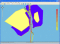
Fig. B - Colour Coded Geographic view of results.

Displaying Results on Tabular Form
The results can be presented as ship-ship collisions. Click on the icon ![]() in the Job View Window and a window similar to fig. C below will appear.
in the Job View Window and a window similar to fig. C below will appear.
Here the striking ships are shown horizontally and the struck ships are shown vertically.
It can for example be seen that the probability of Container ships striking crude oil tankers is 0.0047.
The results can be filtered by leg and collision type.
Remember the colours are relative and do not inform about the absolute severity. The colours identify the maximum values within the current display.
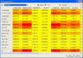
Fig. C - Tabular view of Ship-Ship Collisions

User defined Result Diagrams
The results may also be shown using the Diagram Button ![]() in the Job View window.
in the Job View window.
Here the user can specify the diagrams or chose a default diagram.
The user can choose to have the results shown according to legs or ship type.
In Fig. D, the results are shown per leg. It is seen which legs contribute most to the collision probability of the area. In Fig. E, the results are shown per ship type. Here one can see which ship types contribute the most to the calculated incident frequencies.
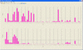
Fig. D - Diagram View, Results displayed for each Leg
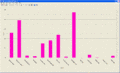
Fig. E - Diagram View, Results per Ship Type


Customised presentation of results
Should the user need to furter customise the presentation of the results of an analysis, the resykts are available on Comma Separated Value (CSV) format.
The results are stored as csv-files in the folder grisk_jobs->{unique string}->results
